
A (not so) short and (yet very) intuitive view of our article Where Flow Matching Leak
Published:
This post is meant to be an intuitive walkthrough of our ICML 2026 paper, written with Gabriel Meseguer-Brocal and Geoffroy Peeters. The paper itself is fairly abstract and mathematical, and I somehow managed to avoid spelling out most of the intuitions we actually had along the way… Yet beyond the love of maths and CS, the love of understanding is probably even more attractive, right? So here it is: hopefully a really vivid and pleasant blog post to explain those intuitions (and there are a lot of them, from a rope metaphor to spaghetti).
What do we want to do?
First things first, let’s start with what we wanted to do.
Generative models are trained on enormous piles of data, a lot of it copyrighted, and that has made one question suddenly quite pressing. It has been showing up in lawsuits from Getty against Stability to the major record labels against Suno and Udio: what does a model actually keep about what it was trained on?
There is a whole field, with many cool figures, trying to tackle this question: memorization. Importantly, there isn’t just one kind of memorization. The obvious one (and the main focus for now) is verbatim memorization, the model handing back a training image or a melody note for note, like this one from Carlini et al.. It is very impressive, but it is also rather rare, since it only happens to a handful of examples among tens of thousands. Instead of catching memorization at generation time, you can also look for it inside the model, where it takes a subtler form. A model can treat its training data differently from data it has never seen, reconstructing it a little more faithfully, behaving a little differently near it, following a trajectory a bit more specific to it, all without ever reproducing it.
Since “memorization” usually points to the verbatim kind, and to keep things clearly separated, we named this measurable asymmetry the membership signal: any trace you can read off a model that tells you whether a given sample was likely in its training set. Hence, it is not a fixed mathematical definition but rather a concept, anything that leaks information about whether a data point belonged to the training set.
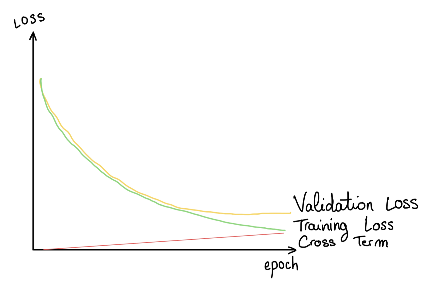
To round out the context, there is an important point that is often misunderstood. What makes the broader memorization question, whether verbatim or the membership signal, so difficult is that you can train a model that has clearly absorbed a great deal of information from its training data while its loss curves still look perfectly healthy: no signs of overfitting, and a validation loss that decreases smoothly. There is seemingly nothing to see. So the whole point is: if this information does not show up in the loss curve, is there a place in the model’s behavior where it might be hiding?
A quick reminder on Flow Matching / Rectified Flow
Memorization phenomena are so subtle that techniques are usually tailored to a specific type of model: DDIM/DDPM, GANs, Flow Matching / Rectified Flows… Those last ones are the ones we focused on.
From now on I’ll just say Flow Matching for both Rectified Flow and Flow Matching. They are not eeexactly the same, but I’m quite sure it’ll be clear enough, and clearly less verbose. One other thing, here I am not talking about the Reflow procedure.
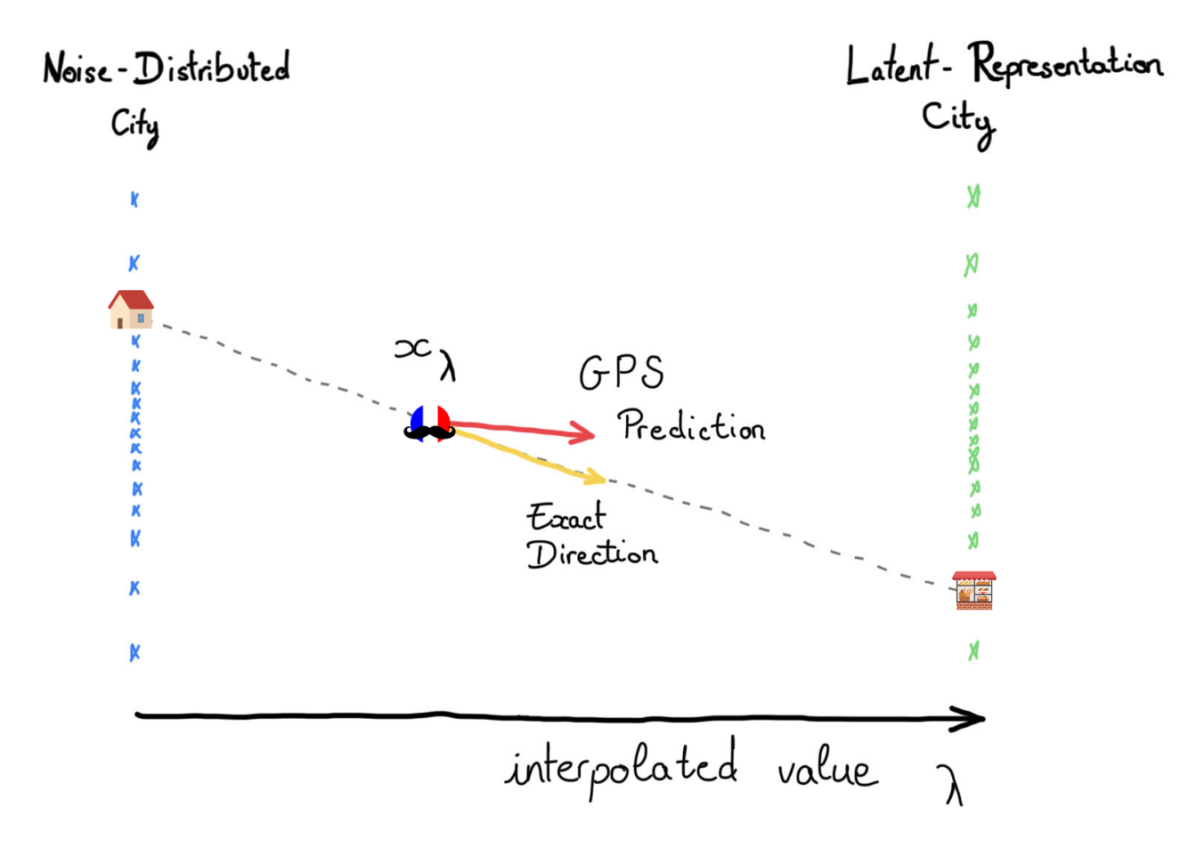
Before getting to the core, let me quickly recall the learning paradigm of Flow Matching. You are probably aware that It is a superstar (… even if its time may be coming, with one-step generation paradigms like MeanFlow or Shortcut models) behind systems like Stable Audio, FLUX, and Stable Diffusion 3. Here, we focus on the linear interpolation version. Pick a noise point \(x_0\) and a data point \(x_1\), draw the straight line between them, and a point on that line is \(x_\lambda = (1-\lambda) x_0 + \lambda x_1\). Here \(\lambda\) says how far along you are: \(\lambda = 0\) is pure noise, \(\lambda = 1\) is the data. The model’s whole job is to look at a point on this line and predict the direction that carries it toward the data. At generation time you start from noise and move along the path with small explicit Euler steps, and the model hands you the direction at each one.
Basically, imagine you are a Noise, at home (i.e. in your so-cosy Noise-Distributed City) and you want to go to your bakery (i.e. in Latent-Representation City, a very famous one) to buy a baguette (you are a French Noise). But your GPS only gives you the DIRECTION you should head in depending on where you are. So what you do is check the GPS, walk a bit, check the new direction, and so on. And this GPS didn’t come from nowhere: you and your Noise friends trained it beforehand by going from many places to many others, and each time, while on your way, you always fed it the straightest direction toward your destination.
Well, congratulations: if you were an extra-dimensional point, you just trained your own Flow Matching GPS using the linear interpolation path!
I actually did a whole blog post on RF / FM and the diffusion based generative paradigme, so make sure to check it if you need a reminder. ;)
Where did we look for information?
Finally (and I promise, after this we’re done with the setup), let me describe the probe itself.
Take one data point, from the training set or the held-out set, mix it linearly with noise to land at some position \(\lambda\) on the path, let the model predict the direction from there, take one big step, and reconstruct where it thinks the data should be. Compare that to the true point: the distance is the model’s error at that position. That is just the Flow Matching loss itself, read at a single \(\lambda\) instead of averaged over all of them:
\[\mathcal{L}(\lambda) = \lVert \text{model} - \text{target} \rVert^2\]Now, it’s worth pausing on what this loss actually contains, because it’s the key to everything after. We decided to bring in the optimal predictor which is (obvisouly) the best any model could possibly do at this point. Expanding the squared norm gives three terms:
\[\mathcal{L} = \underbrace{\|\text{model} - \text{optimal}\|^2}_{\text{approximation error}} + \underbrace{\|\text{optimal} - \text{target}\|^2}_{\text{irreducible residual}} + \underbrace{2\langle \text{model} - \text{optimal},\ \text{optimal} - \text{target}\rangle}_{\text{cross-term}}.\]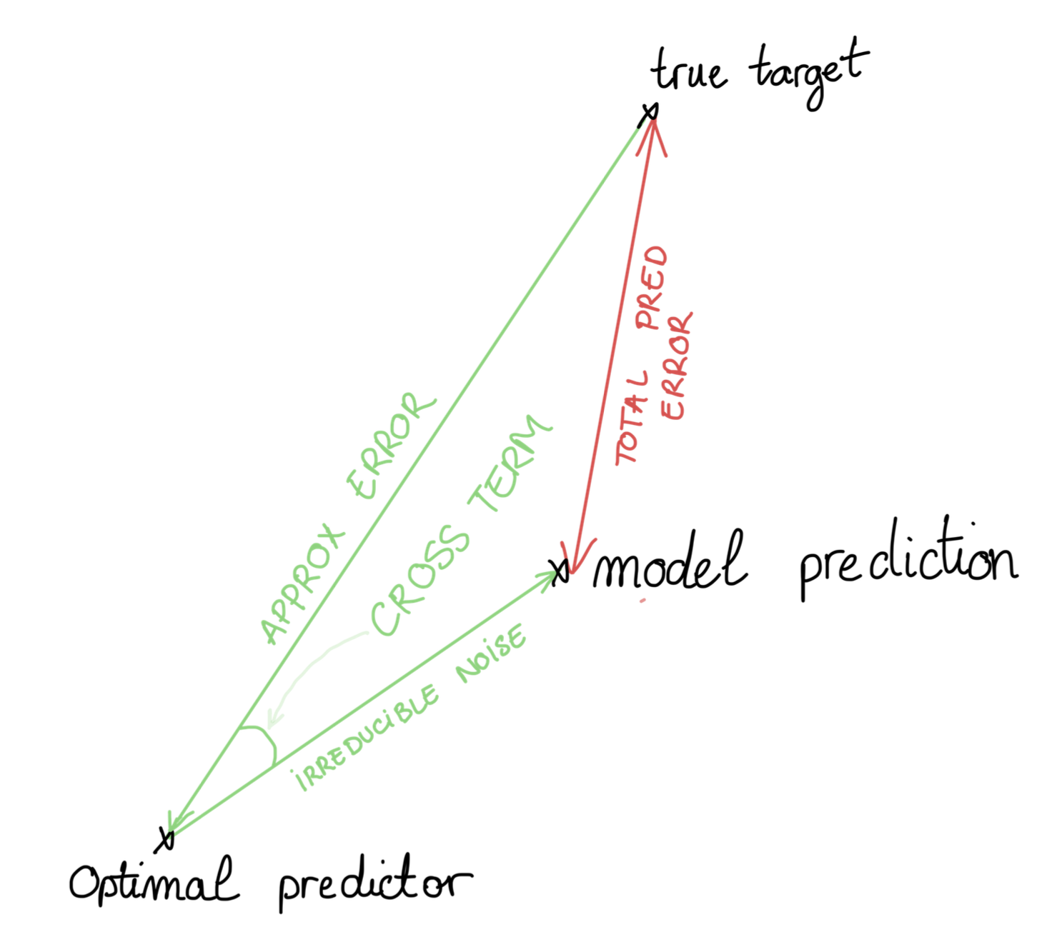
The first term is how far the model is from the best possible predictor. The second is the sample-specific residual, the part of the target that no predictor can infer from the current position alone. And the last one, the inner product which measures whether the model’s error is aligned with that residual.
The first two are, in a sense, “innocent”: every model pays them, on training and held-out data alike. The third one is the interesting one, and it’s the only place where being a member of the training set could leave a mark. (Keep it in mind, we’ll come back to it and make it fully precise near the end !)
So how do we get to it? The trick is a subtraction (what a trick!). We run the probe on many samples, separately for the training set and the held-out set, and look at the average difference in error between the two, as a function of where we started (i.e. the \(\lambda\)). Since the two “innocent” terms behave the same on seen and unseen data, they cancel out, and what survives is essentially that lonely cross-term, the one place a training bias could hide.
That those two terms behave the same on training and held-out data does rely on two mild assumptions, which describe a properly trained model:
Assumption 1 (Uniform approximation error). The model is no closer to the best predictor on its training points than on the population at large. In other words, it hasn’t done anything special on the samples it saw, which is what you get when the model hasn’t overfit in the classical sense (early stopping helps here). Note that this does not forbid a train-test gap in the loss; it only forces that gap to go through the cross-term.
Wait, doesn’t that assume the whole thing away? Not quite: the assumption fixes how far the model lands from the ideal prediction, the same for members and non-members, but says nothing about which way the leftover error points. That direction is where the leak hides, so we’re only ruling out crude memorization, not the subtle kind.
Assumption 2 (Representative sample). The empirical noise floor matches its true value, which is essentially just the law of large numbers for a large enough dataset.
And that’s the whole idea: the train-test gap is a subtraction designed to isolate the one thing we want, a bias (if it exists) toward the training data, el famoso membership signal.
The observation that started it all
So now we had a clean setup and a way to measure this bias, but we genuinely didn’t know what it would look like. Maybe a flat line, if there’s no bias. Maybe a bump near \(\lambda = 1\), close to the data / noise or even both? Instead, in every single configuration we tried, the gap traced the same curve: a bell. Flat and near-zero at both ends of the path, rising to one clean peak somewhere in the middle.
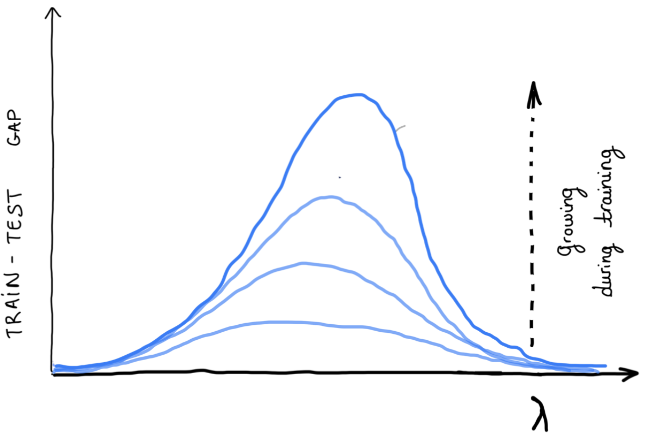
It came back for audio and for images, for transformers and UNets, across latent spaces and noise parametrization. Obvisouly, it’s exactly what pushed us from “we have nice measurement” to “we need to explain why”. Why a bell at all, and Why does it peak in the middle?
Even crazier, this doesn’t appear randomly at the end of training. It grows steadily during training, well before any visible overfitting.
The Hourglass
Now that we’ve run through the experiments and laid out the setup, let’s get to the real explanations. Buckle up a little because there are several of them, they are all tangled together. But, in the end, they make a pretty nice story (backed up of course by theory and the experiments in the paper).
Let’s picture the Flow Matching path in 3D: two flat planes facing each other, the noise distribution on the left and the data distribution on the right, with the interpolation paths running between them. Every sample is a single straight line, tied from its noise point on the left to its data point on the right, so the whole thing is a bundle of straight spaghetti stretched across the gap.
Now pull the two clouds apart and look at the bundle from the side. Because each spaghetti strand joins a scattered noise point to a scattered data point, the bundle isn’t a uniform tube. It forms an hourglass: wide at both ends where the points are spread out, and pinched in the middle where all the spagheto funnel through a narrow waist.
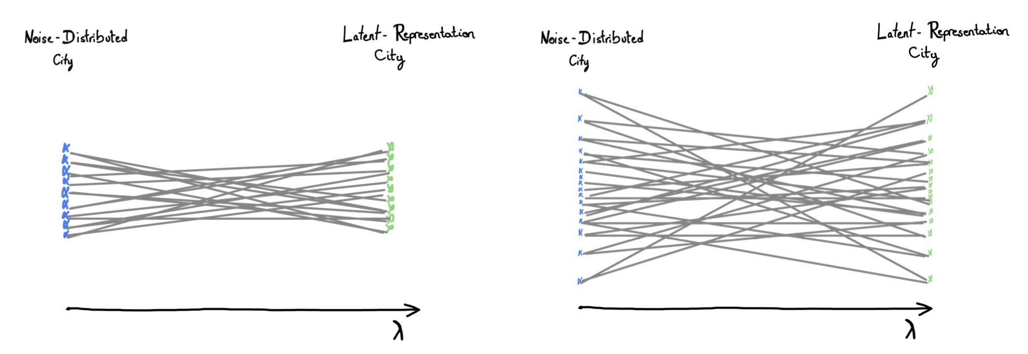
And this bundle isn’t only a picture of the data. It’s essentially the flow field the model ends up learning: at each point in space, the spaghetti strands passing through are exactly what tell it which way to push. So the shape of the bundle is the shape of the model’s job, and what an interesting coincidence that the pinch of the hourglass seems to sit at the same place as the peak of the error, no?
Now think about the model’s job at each point: given your position, predict your direction. Near the ends, this is easy, and for the same reason at both. At the start, out in Noise-Distributed City, your exact position sits on essentially one sensible trip. You’re far from the bakery, the Latent-Representation City clustered off in one general direction, so where you stand points you cleanly toward where to go. And at the very end, near the data (i.e. your bakery), it’s the mirror image, you’re right next to your destination, only one trip realistically ends here, so again your position tells you your direction almost for free. Either way, few contradictory routes pass through where you’re standing, so a simple rule nails it.
In the mean time, in the middle your position sits in the crowded central square, the spot where trips coming from every home and heading to every specific places of Latent Representation City all cross. The same location is compatible with dozens of different directions, and no simple rule can tell which one is yours. Should I take this road or that one? Genuinely hard to say, and it’s exactly here that knowing a shortcut, or the specific one right answer, would save you the most.
Hence, there is a region on the path, where position becomes a much worse guide to direction because position alone becomes ambiguous. In the clean Gaussian case, we can even compute where that region sits in closed form, from the variances of the noise and the data alone, with nothing about the model in it. (We’ll come back to this later)
That’s the part I find most surprising. The peak is not just somewhere in the middle but rather its location seems to be fixed by the geometry of the problem. We change the architecture, the model size, or the training details, and the bell may get taller or flatter, but it stays in the same place depending on the data.
At this point, that’s only an observation and the theory will come later. But already suggests something a bit unusual: the model seems to impact how visible the leak becomes, while the data and noise distributions decide where along the path we should look for it. Even more, that stable location is also the region where the position is least helpful for deciding which direction to take.
Here, I’ve been a little sloppy on purpose. I suggested the model runs out of information, when what really runs out is one particular kind of it. Fixing that sloppiness is another really cool piece of the paper, so it deserves its own section.
Why the leak has to exist
Okay, as I just said, I lied a little (purely for pedagogical purposes, you know…). Near the pinch, the model doesn’t run out of all information, only the easiest kind to learn: the simple linear one, that “read your direction straight off your position” rule we just watched collapse in the crowded square.
One quick disambiguation, because linear is doing double duty here. The path is linear: the straight segment from noise to data, the spaghetti strands, and that never changes. What changes along the path is whether the direction can be read off your position by a simple linear rule. Two different “linears”, then: the road is always straight, but the guidance is only linear near the ends. It’s the second one that collapses at the pinch, and the leak lives in that collapse.
So what does nonlinear actually mean, back in the streets? A linear rule is a smooth one: shift your position a little and the right direction shifts a little too, in proportion. Step a bit east, aim a touch more west, nothing dramatic. That’s fine near the ends. But in the crowded square it breaks, because two spots barely a step apart can call for completely opposite directions: this walker peels off east toward the bakery, that one veers west toward the cinema, and they’re standing right next to each other. It is quite impossible for smooth, gentle rule to do that, and you need a rule that turns sharply depending on the fine details of exactly where you stand.
And notice why the smooth rule could never do the memorizing for us, however much data it saw. A linear rule is a single instruction that everyone follows the same way: “lean east in proportion to where you stand.” There is only one such rule for the whole city, so it has nowhere to store “you, specifically, third door on the left.” To single out one trip, the rule would have to change depending on which trip you are, and a rule that changes from spot to spot is exactly what we just called twisty. That’s not a coincidence: bending the rule to fit one trip is the definition of going nonlinear. So memorization doesn’t just happen to be easier in the nonlinear regime but rather can only live there.
This is where the distinction between generalization and memorization becomes a bit blurry. Near the pinch, the model cannot rely much on the simple linear rule anymore, so it has to learn more detailed turns. Some of those turns are genuinely useful: they point toward the right neighbourhood, and many trips share them. But the model never receives a clean label saying “this part is the neighbourhood rule” and “this part is just the turn toward this exact bakery”. It only sees complete trips. So the useful turn and the private detail arrive together. Across many trips, the shared part is what becomes generalization. But on any particular training trip, it is still mixed with small sample-specific quirks, and the model can absorb a little of those quirks while learning the useful structure.
This is roughly what I mean by a membership signal. It does not have to be a dramatic failure, or a memorized copy of the sample. It can simply be a small residue left by the fact that this exact trip was part of training. It’s the flip side of learning itself: to capture the real shape of the city, the model can’t avoid memorizing a few private doors along the way.
Why nothing shows up on the dashboard
So the signal is always there, we understand why it looks like this and why it has to appear. And yet no standard metric catches it. Why? There are two separate reasons that compound.
Dilution. The signal lives in a narrow band near the peak, but training monitors the loss averaged over the whole path. If you spread one sharp local effect across the entire interval, it barely moves the average.
Masking. This one is subtler. Early in training the model is still learning the generalizable structure, and that lowers both the training and the validation loss together. Underneath, on the training side, the leak term is quietly growing, but it is buried under the much larger gains from generalization. On the validation side, the leak term is absent, since the model never saw those sample-specific residuals. So validation keeps dropping and looks perfectly healthy, while the membership signal accumulates silently.
What the gap is actually measuring
A bit more explanation, but hang in there, we’re getting close to the end.
To understand what the gap is measuring, we need to come back to the decomposition I mentioned earlier. As I said Matching is trained with a mean squared error. If we insert the optimal predictor between the model prediction and the true target, the prediction error can be written as the squarred sum of two vectors: the model’s approximation error, and the irreducible residual, meaning the sample-specific part of the target that cannot be inferred from the current position alone.
Since the loss is the squared norm of that total error, expanding it gives two squared norms plus a cross-term that measures how aligned the two vectors are.
That alignment is where membership can appear. On held-out data, the model has never seen the residual attached to that point, so the alignment has no systematic direction and tends to average out. On training data, the model was fitted on those residuals, so a directional bias remains. The other two terms mostly behave similarly on seen and unseen points, so the train/held-out difference isolates this alignment term.
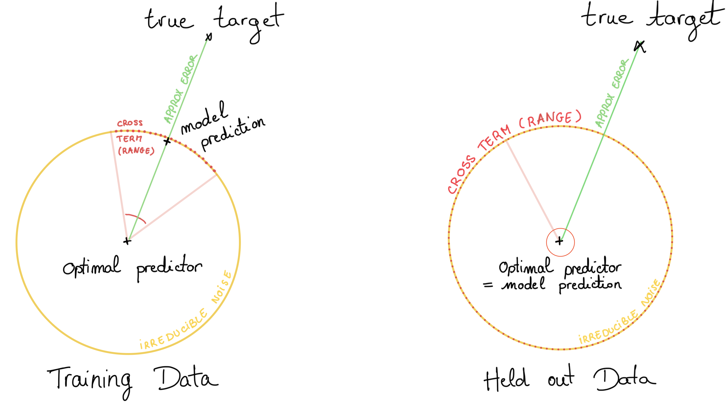
As you can see now, the gap is not just a convenient diagnostic but what’s left is the membership signal we were trying to isolate. And where along the path is it largest? If you didn’t skip straight to this line, you already know it is at the pinch of the hourglass.
From intuition to a real prediction
Everything so far has been intuition. To first need to turn it into something we can actually compute and verify. We will look at the one case where the maths stays clean: the Gaussian case.
In that setting, the optimal least-squares predictor is provably linear. So when we study the linear predictor, we are not just making a simplification but we are studying the target the network is trying to approximate in the ideal limit. And after some math, the membership signal turns out to be proportional to the irreducible variance (the part of the velocity that cannot be predicted from position).
That variance is largest exactly where the linear information vanishes, at the pinch of the hourglass. From that proportionality, the bell shape, the peak location, and the \(1/n\) decay all become much less mysterious. All those metaphors were pointing to something real, and the Gaussian case gives us a way to compute it.
Of course, a fair question is why a Gaussian model with an optimal least-squares predictor should say anything about a real transformer trained on real latents.
Well, it remains informative for two reasons. First, in the Gaussian case, the optimal solution is linear independently of the architecture used to approximate it so this what will tend to reproduce the transformer optimaly. And in practice, spectral bias suggests that neural networks tend to learn simple, low-complexity structure first, before fitting the more nonlinear scramble, which is exactly the part that becomes important when the linear signal weakens. Second, we work in the latent space of an autoencoder, and those latents are often designed to be roughly Gaussian and isotropic, either through an explicit KL penalty or through bounded activations like tanh.
So the Gaussian case is not meant to describe the world perfectly. It is the clean case where the mechanism becomes visible, computable, and therefore testable. In this context, we were able to derive a precise location of the gap’s macimum depending only of the Noise and Data covariance. Hence, the ultimate question is whether this actually happens in practice. (and it does ;) )
Does the whole story actually hold?
As we said, the nice thing about predicting a specific location is that you can actually try to break the prediction. So we tested it in both directions, this time directly with transformers and real latents.
First, we moved the peak on purpose. Our formula says that the location depends only on the covariances at the two ends of the path, so we pushed on each end. Scaling up the noise variance shifts the peak as predicted, and swapping the training dataset for one with a different structure shifts it again, with the prediction still matching.
Then we did the opposite and varied things that the theory says should not move the peak: the architecture (transformer versus UNet), the model size, and the sampling scheduler. The peak barely moved; mostly, it was the height that changed. Roughly speaking, the geometry of the data seems to decide where the peak sits, while model choices mostly decide how high it gets.
There is also a case where things become less clean. On image latents from a VAE, the distribution is much less Gaussian: heavier tails, stronger correlations, and generally a messier geometry. In that setting, the closed-form peak location failed. But the leak itself does not disappear. The gap is still there, with the same broad bell-shaped profile. So it is not that the Gaussian calculation invented the signal. It mostly gave us a clean way to locate it.
I find this more reassuring than disappointing. The theory is not magical, it gives a clean version of the mechanism under clean assumptions. When those assumptions become shaky, the exact location becomes harder to predict, but the broader picture remains: the signal concentrates where the predictable part of the velocity is weakest and the sample-specific residue is hardest to ignore.
Finally, we also checked the most direct version of the story: is the leak really largest where the linear predictor struggles the most? To test that, we compared the performance of a linear predictor with the membership signal measured on the transformer. The two line up: the transformer leaks most precisely in the region where the linear predictor performs worst. This is reassuring, because it connects the experimental peak back to the mechanism we started from. At least, it makes the pinch explanation much more backed up: the peak appears in the same region where the linear part of the problem stops being enough.
And that’s basically it! You understood evrything from our article, the left over is only protocols and theory.
A small note on a common training trick
There is a nice connection with something people already do in practice. In modern Flow Matching systems, the middle of the path is often treated as especially important, and some empirical timestep-weighting schemes put more emphasis there. The Stable Diffusion 3 paper, for instance, recommends this, although the intuition behind it is not always made very explicit.
The picture from this post gives one possible way to think about it. The middle is where the hourglass pinches. It is the region where the simple, almost linear guidance becomes weakest, so the model has to learn the more delicate part of the transport map. In that sense, putting more effort there is not so surprising: it is where the model is asked to resolve the most ambiguous part of the path.
But this is also where the sample-specific residual is hardest to ignore. So the same region that looks especially useful from a training point of view is also the region where our theory expects the membership signal to be strongest. I would not phrase this as “the trick causes the leak”, but rather as a small warning: the part of the path we like to emphasize for efficiency may also be the part where privacy signals are easiest to pick up.
What comes next?
We only glanced at reflow, and the early signs are that the bell survives but flattens out, which hints that reflow might double as a natural defence. Text-conditioned generation, stronger threat models, larger deployed systems: all still to do.
But the core idea is still quite small, and I do find it beautiful. A generative model can leave a structured trace of its training data at a place we can often predict ahead of time, while the usual training curves still look perfectly healthy. And the strange part is that this trace is not just a sign that the model failed. It appears because the model learned useful structure, and picked up a little sample-specific residue along the way.
Thanks for reading! I sincerely hope this post made the paper feel a bit less abstract and a bit more intuitive. If you have questions, disagreements, ideas to collarate, or spot something I got wrong, please do reach out, I would genuinely love to hear it !
The figures are sketches of the intuitions rather than reproductions of the plots in the paper, so take them as drawings on a whiteboard, not as results. :)